Laleham school charity logo
Industry logo design created for the charity: ‘Friends of Laleham Gap School.’ who are a charity which focus on aiding the school, Laleham gap in Ramsgate. They focus on providing funding and help for SEND students. They wanted this logo to be used for their complete identity, and for their letterheads, banners, awards ect. At the time they had very little in terms of professional identity and they put their trust in me to understand the brands intentions and provide a suitable logo.

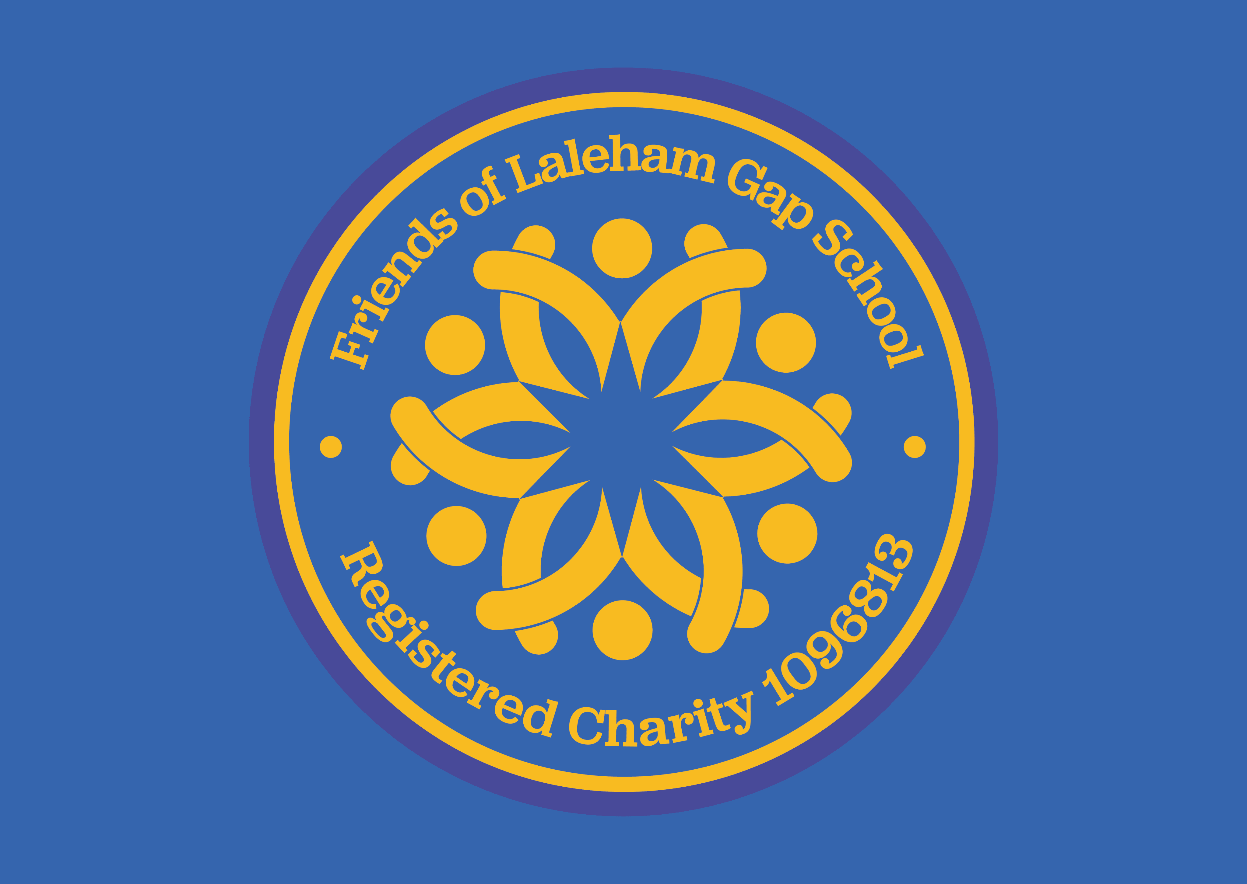


People linking arms forming trust and equality amongst each other
Star shape formed from the negative space to signify the brand’s focus on aiding their audience.
United symbol formed from all elements, representing their commitment and passion for their work.
1
2
3
The breif:
Overview:
Our charity, Friends of Laleham Gap School, is dedicated to supporting the community of Laleham Gap School. We focus on aiding children and families who have Special Educational Needs and Disabilities (SEND). We provide experiences and resources that may not be the responsibility of the Local Authority or school to provide. Our target audience includes donors, beneficiaries, and volunteers. We primarily engage with individuals and organisations who are passionate about supporting children who are underprivileged.
Objectives:
The purpose of the logo is to give us a more professional presence when engaging with larger benefactors. This logo will appear on our certificates of thanks, letterheads, banners, the charity website (currently being developed), and business cards. It should reflect our mission and the community we support. However, it should not be entirely corporate looking and still be identified as a charity that benefits children within the school community.
Design Preferences:
The logo should be fairly contemporary in its design. Please explore a colour palette closely related to the school colours of dark blue and golden yellow. Please feel free to add other shades of blue and perhaps some purples as appropriate. A circular design or an image that represents togetherness, with the words "Friends of Laleham Gap School" incorporated or below. The design should convey credibility and trust.
Logo breakdown:
Text copied from original email

Industry logo design created for the charity: ‘Friends of Laleham Gap School.’ who are a charity which focus on aiding the school, Laleham gap in Ramsgate. They focus on providing funding and help for SEND students. They wanted this logo to be used for their complete identity, and for their letterheads, banners, awards ect. At the time they had very little in terms of professional identity and they put their trust in me to understand the brands intentions and provide a suitable logo.
Laleham school charity logo
The breif:
Text copied from original email
Overview:
Our charity, Friends of Laleham Gap School, is dedicated to supporting the community of Laleham Gap School. We focus on aiding children and families who have Special Educational Needs and Disabilities (SEND). We provide experiences and resources that may not be the responsibility of the Local Authority or school to provide. Our target audience includes donors, beneficiaries, and volunteers. We primarily engage with individuals and organisations who are passionate about supporting children who are underprivileged.
Objectives:
The purpose of the logo is to give us a more professional presence when engaging with larger benefactors. This logo will appear on our certificates of thanks, letterheads, banners, the charity website (currently being developed), and business cards. It should reflect our mission and the community we support. However, it should not be entirely corporate looking and still be identified as a charity that benefits children within the school community.
Design Preferences:
The logo should be fairly contemporary in its design. Please explore a colour palette closely related to the school colours of dark blue and golden yellow. Please feel free to add other shades of blue and perhaps some purples as appropriate. A circular design or an image that represents togetherness, with the words "Friends of Laleham Gap School" incorporated or below. The design should convey credibility and trust.
Logo breakdown:
People linking arms forming trust and equality amongst each other
1
Star shape formed from the negative space to signify the brand’s focus on aiding their audience.
2
United symbol formed from all elements, representing their commitment and passion for their work.
3